Blog articles in 2018

Pantone Colour of the Year 2019

Pantone have announced their colour of the year as PANTONE 16-1546 Living Coral. An animating and life-affirming coral hue with a golden undertone that energizes and enlivens with a softer edge.

"Vibrant, yet mellow PANTONE 16-1546 Living Coral embraces us with warmth and nourishment to provide comfort and buoyancy in our continually shifting environment."

Pantone says the shade was selected in reaction to the onslaught of digital technology and social media which is increasingly embedded into daily life. Sociable and spirited, they believe the engaging nature of this colour welcomes and encourages lighthearted activity. Optimistic and joyful the tone embodies our desire for playful expression.

We've already seen a resurgence in pink tones for interiors so it feels like peachy shades will become the new 'millennial pink' as we move into 2019. While unlikely to be a popular choice for floors we can see it complementing grey and cream shades of carpet perfectly.

Christmas styling ideas

It's the most wonderful time of the year so we thought we’d take a look at some different ideas for styling your home for Christmas....

Simple Chic

A contemporary option is to go for a neutral and minimal theme. Tonal decorations in complimentary colours make a sophisticated but stylish statement with clean lines and natural details giving this look a slightly Nordic feel. The key to this interior theme is to always opt for simplicity and make the whole scheme look effortless. Choosing to have fewer items when decorating for Christmas stops the room looking like a grotto and draws attention to key pieces like the tree. Doing this allows you to be really selective and invest in luxurious items that look beautiful and unique. Accents such as the brown paper wrap presents with twine ties and leafy green labels are classy but unassuming too.

Cosy Classic

A stone walled space could easily look quite cold and detached but by including a patterned carpet, contemporary furniture and using metallic accessories to pull it all together it becomes timeless and cosy. The pale wood bench has been dressed for the season with fur, candles and brass accents to update the look while keeping a traditional homely feel. Our Abbotsford Heather Kilgour was used to add cosiness and warmth, something that plaid carpets are perfect for, hence why they are one of the most popular patterns for floors. The great thing with choosing this style for Christmas is that it can easily be mixed, matched and added to as the season unfolds, creating just the right mood you need when entertaining friends and family.

Winter Wonderland

Christmas is a special time of year but you don’t necessarily need to have fairy lights and decorations hanging from the ceilings to create a magical feel. When Jordan and Russell from 2LG styled this room they had only just started their renovations but wanted to create a lounge area with a wow factor. Our Timorous Beasties Midnight Grain du Bois carpet looks great here and adds colour to an otherwise plain space. Glass candlesticks and gold framed paintings added some interest and splendour for the Christmas season was given to the faded backdrop with a giant real tree. It was dressed simply with trailing ivy and white dressmaking fringe to provide interest and glamour. When the greenery looks like this you really don’t need much else!

When it comes to festive decorating you can afford to experiment and be completely over the top with colour, pattern and even novelty accessories. As long as your Christmas styling takes influence from the existing decor and reflects your personality it will work for you.

Q&A With Ruth Crilly of A Model Recommends

We love to see what inspires people to choose Brintons. Ruth Crilly from 'A Model Recommends' talks to us about her latest renovations and why she chose Timorous Beasties carpet for her home.

Tell us a little about yourself

I’m Ruth Crilly, I’m a full-time beauty and lifestyle writer and vlogger under the name “A Model Recommends”. I’ve been blogging for over eight years and before that I was an international fashion model for over a decade. I’ve been with my husband, who’s a fashion and portrait photographer, for fifteen years and I’m now a Mum to a three year old girl and one year old boy. We live in rural Somerset with our dog and house cat in a Georgian country house.

How would you describe your style?

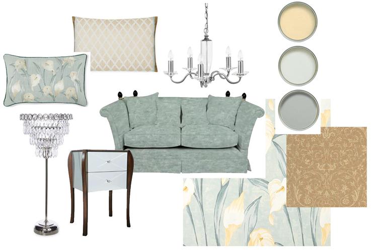
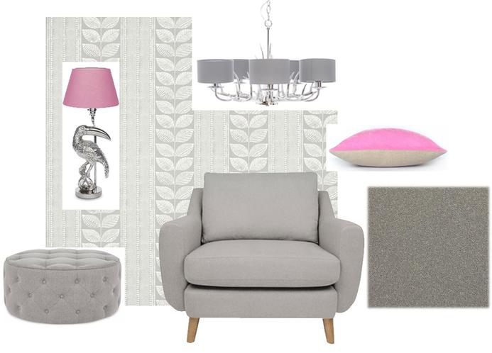
In terms of fashion – and probably interiors too – I’m quite understated and classic, but I enjoy the odd splash of print and colour. Before falling in love with our Georgian house, we were very into mid century modern and completely renovated a seventies house that was on stilts next to a river. The Georgian thing has been a bit of a change! But I still love clean lines and simple, elegant shapes. I don’t like a lot of clutter, but when you have a small family there’s no point battling the mess!

How has your home needed to evolve as the family has changed and grown?

Well, we started off with glass coffee tables and amazing vintage things and then gradually started swapping over to sturdier, chunkier things that wouldn’t potentially cause accidents! Our main concerns seem to be safety and comfort, so it’s more of a challenge trying to keep any sort of sense of stylishness. The kids climb over furniture, accidentally scrape sharp objects along the paintwork and generally cause havoc so I can’t have anything that we need to be TOO precious over. Or if it’s precious then it needs to be workable and durable.

What made you choose carpet?

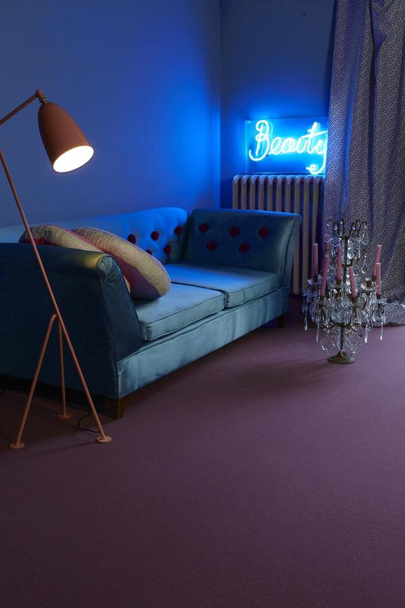
We both hate wooden floors! I know that’s controversial, and we’ve kept one that was exposed upstairs, but the racket from things falling on wooden floors! The sound of shoes trip-trapping on them! It drives me mad! Add to this the fact that in our house you could actually FEEL the draught coming up through the gaps in the floorboards and carpet was a no-brainer. Our whole house was carpeted before this, and the one before that too, pretty much. I mean I’d never carpet a kitchen/utility or bathroom and maybe not a dining room because the floor needs to be wipeable but everywhere else is fair game. I’d probably carpet the walls if given half a chance.

We wanted an amazing, striking pattern. The rooms are big, and plain colour just felt like a sea of carpet and very blank, so when we saw the Timorous Beasties collection we were quite wowed. Pattern is also great with kids because they drop absolutely everything on the floor and if you can hide at least some of the accidents then you’re doing well. It’s quite a nervewracking thing to go for pattern, but the pay-off is amazing.

What are your main sources of inspiration for your home?

I love old, grand country houses – comfortable ones with log fires and slightly battered furniture – but I also can’t shake my love of modernist design, so I suppose I constantly look at both and try to find ways of mixing them. So far I’ve done more looking than buying because I’ve been known to make the odd mistake with impulse buying and I’m taking it slowly!

What was the last piece of homeware you bought?

The Noir Ruskin Butterfly carpet for what is going to be a family room/library. I say library because it sounds pleasingly grand but really it’s a couple of walls of books!

Q&A with Kim Stead from Twool

Brintons are proud to be British wool's single biggest user, and work closely with organisations and like minded brands to raise awareness about the unique, natural and sustainable benefits offered by wool.

As it's Wool Week we caught up with Kim Stead (AKA "Mrs Twool") and asked her more about her business  'Twool'....

What is Twool?

Sustainable garden twine, woolly bags, hats and dog leads made from the wool of rare-breed Whiteface Dartmoor sheep using British heritage manufacturing.

Where did the idea come from?

The origins of twool start with the frustration of rotting jute twine on raspberry canes in our Dartmoor facing garden. There are 27 million gardeners in the UK and we import over 3000 tonnes of jute in from Asia every year. Wool is an under-used natural resource and was a natural choice for developing a sustainable and ethically responsible all British garden twine.

Why is the rare breed Whiteface Dartmoor sheep important?

This rare-breed has been on the moor since Anglo-Saxon times. They're a big sheep, make good mothers and the most glorious long 'lustre' wool fleece. Declining numbers saw breeding ewes fall to under 1000. Making a use for the wool and a route to market for the farmers, twool hope to be a part of the story of the future for the Whiteface Dartmoor.

What has been your favourite ‘Twool’ moment so far?

It's been a rollercoaster sort of journey, but the highs include our first ever RHS Chelsea Flower Show back in 2013 when, in our inaugural year, we were made finalists for Chelsea Garden Product of the Year. The reality of making the twine and the recognition of others acknowledging the product is something that I will never forget. I'm so proud, because we had the backing and sponsorship of the British Wool Marketing Board and brands like Brintons showcased on our stand too!

What made you choose Brintons?

Fabulous wool carpets! The quality of Brintons, it's history of working with wool and the synergy between their working ethos and ours made them the natural choice when looking for carpets. We've been so lucky and proud that Brintons have sponsored our show stands by supplying gorgeous carpets that complement our product range so perfectly – they really do finish our stand to the highest of standards.

Which is your favourite room in your own home?

Woolly HQ – it's where all the ideas are generated and being able to work at home on Dartmoor is inspiration in itself.

Explain your interiors style to us.

Wool, wood and natural fibres, usually inspired by the natural surrounding of living on Dartmoor.

Inspired by Laura Ashley - Guest blog

Thinking of giving your home a new look but don’t know where to start? The Laura Ashley design service is a fantastic (and affordable) way to inspire you. Their creative designers can give you valuable advice on an existing scheme in your home you might want to freshen up or if you‘re doing a complete renovation/revamp they can advise you all the way through your project.

We asked Kay Cullen, one of the designers at Laura Ashley, to create some inspired schemes from their new range which work seamlessly with the Laura Ashley Carpet Collection:

Florals never really go out of style, and we continue to be inspired by them at Laura Ashley. This season they’re back with a twist. From delicate romantic prints to the contemporary stylised block print leaf, the designs all come in lovely tones to cheer us up this Autumn.

The Malmaison Linen carpet is a favourite of ours from the collection and it’s perfect to use when creating a traditional yet glamourous interior. It complements most florals and in this scheme we have chosen to team it with pale gold paint for an opulent feel and a feature wallpaper in Lilium grey green for a smart, elegant look. The scheme is kept fresh with a contrast of grey green and pretty lighting.

For a more contemporary look we have used the ever popular tones of grey and given a bright injection of contrast in raspberry/pink. The Bell Twist carpet in Steel allows the bolder elements of this scheme to stand out (such as the quirky toucan lamp) while adding a bit of luxury feel underfoot. Laura Ashley have a wide range of upholstered furniture and accessories that help to complete the look.

Whatever your style, the Laura Ashley Design Service is perfect for interpreting ideas and vision into reality to create a beautiful interior. Our experienced designers cover all regions of the UK, Ireland and Europe and will work with you to make the process as easy as possible. They bring along all wallpaper, fabric and carpet samples so you can start creating your scheme together!

Inspired by Dulux Colour of the Year

Dulux have revealed ‘Spiced Honey’ as their colour of the year for 2019. A departure from the grey and lilac themes that have been everywhere of late, we were quite pleased to see caramel tones making a comeback. These shades are perfect to create a warm and cosy room and turn your home into a peaceful and relaxing space.

Dulux’s ‘colour of the year’ is decided by an expert panel of colour designers, design specialists, trend forecasters, architects and editors from around the world who join together to discuss what we increasingly need from the spaces around us. Capturing a universal theme, they suggest a colour that they believe embodies the mood of the moment and will be popular in the year ahead.

Dulux says “As we move forward into 2019, we find this pause has given people time to re-energise and deal with the sense of unpredictability with positive action, optimism and purpose. If the unpredictability of last year forced people to retreat and regroup, 2019 is the time for their awakening. We are ready to “Let in the Light”. This palette is about creating a home where we can surround ourselves with the people and things we love – and also where we can be kind to ourselves. It’s about having somewhere to enjoy time with friends, neighbours and family."

'Spiced Honey' has been identified as a colour that can complement richly pigmented shades like terracottas and reds but work equally well with neutrals too. If you would love to incorporate this colour into your floor then take a look at our carpet selector to see similar tones.

Brintons wins at the National Flooring Innovation Awards

The winners have been announced in the National Flooring Innovation Awards 2018 which sets out to identify products and services that are genuinely new and exceptional within the flooring sector.

We are excited to have been recognised with two prestigious awards:

Marketing - Bring your home to life with Brintons Carpets

“A stunning, room-size 3D model landscape was built from multiple carpet ranges illustrating the breadth of colour and texture of Brintons’ portfolio. The model was centre-stage at the Harrogate Flooring Show in 2017 and led advertising and creative campaigns throughout 2018.”

Design - Perpetual Textures

“A new woven axminster range with eight sophisticated and understated contemporary patterns taking inspiration from natural fibres and textures. Clever texturing techniques including mottles, striés and fades add to the appeal.”

Awards scheme organiser Bridgette Kelly commented: “The first year of the scheme has been a phenomenal success with far more submissions than even we expected and exceptional quality across the board. This industry has an appetite for innovation and that is clearly a strong factor in securing future success.”

Styling with patterned floors

Patterned carpets have become extremely popular for high traffic areas like living rooms, hallways and stairs as they can make a design statement whilst being both practical and welcoming. We are proud of the diversity in our collection so have selected some of our favourite Brintons roomsets to inspire your next patterned carpet choice!

Make a Statement

Statement carpets are a great tool to style a room with as the décor can then be kept simple to not detract from the alluring floor. Using large scale pattern and avoiding symmetry, the gentle meandering sprawl of the Timorous Beasties Noir Ruskin Butterfly, with its delicate organic background texture has been used here to create a completely individual lounge area. Mid century furniture and greenery give it a sophisticated but fun feel. The interlocking key pattern in our Perpetual Textures Isochrone carpet has been added to this simple dining area to create a focal point and adds depth and interest to the room.

Classic Styles

Traditional designs are obviously perfect for period properties but if you’re feeling brave can easily contrast within a more modern space too. Our Renaissance Classics Khali Fire carpet makes a strong statement and complements a backdrop of subtle tones and elegant accessories in this seating area. Inspired by the golden age of Persian art and literature the carpets rich and opulent colours is used to stunning effect. In a contrasting approach, our Renaissance Classics Medici Blue carpet looks beautiful against a dominant black staircase and turquoise painted brick. Stylish accents of art and tribal themed wall accessories have given this classic scroll a contemporary feel.

Textured Effects

Our new Perpetual Textures range took inspiration from natural fibres and these carpets were designed to add a calming influence to a home. These subtle details offer an exciting alternative to a plain carpet and techniques including mottles, striés and fades were used to give a depth to the designs while keeping the practicality of a cut pile. The beauty of this type of pattern is that it really will go with anything. You can add accent colours, eclectic accessories and contrasting patterns to bring the space to life as shown in the examples here.

For help identifying the right carpet for you our Choosing Your Carpet page lets you narrow down our collections by design style, colour and range. You can also select up to 8 items and order free swatches to your door so you can see which colours and patterns will work best in your home.

Why do we love neutrals?

Neutrals have a long history in interiors of the 90s, early 00s and even into current schemes with beige and then grey taking it in turns to be at the forefront of UK home design. Here at Brintons we’ve seen these shades remain firm favourites for years now and here are some of the top reasons why we all love neutrals.

Versatility

A neutral will allow you to introduce items and objects that are personal to you. The neutral design of the rest of the room, will ensure that the personal objects, which give your home its identity and reflect its owner, will shine and become the focal point rather than fighting against the rest of the scheme.

Buying/Selling

It is well known that a neutral interior will make any property attractive to a potential buyer, especially if you are decorating to put your property on the market, selecting a good quality carpet in this shade will inevitably work in your favour during a sale, instead of an old, or cheap carpet, as it helps make the home feel well designed and welcoming.

Show off your architecture

A neutral scheme will also work well where you want the property’s architecture to shine through providing the perfect setting for the design and build to take the forefront, whilst also retaining and ensuring the interior is welcoming.

Timelessness

Decorating with neutral shades and carpets ensures that your scheme will have longevity, as a base you can bring in accessories to add on-trend elements, whilst retaining an overall scheme that will remain timeless for many years to come. For many a neutral carpet is an investment in the design of the property, which will add and retain its value.

Remember though; not all neutrals are equal and of course we truly believe a cheap floor will turn a classic neutral scheme into something with very little appeal. For the scheme to work, a good quality wool-blend carpet is essential. Take a look at our neutral shades for some more inspiration.

Looking after your Brintons carpet

Brintons carpets use an 80% wool/20% nylon blend that creates long-lasting luxury and optimises performance from both fibres. Some people are nervous about choosing a wool product for their home but with a little care and attention it's really simple to keep a Brintons carpet looking good for years. Here are a few of our top tips:

Regular vacuuming

It sounds obvious but regular vacuuming is the most important thing you can do to keep your carpet clean. You cannot over vacuum a carpet and it will not harm your carpet if you do it as soon as it has been laid and at regular intervals after that, even if it does not look particularly dirty.

Use an entrance mat

All types of flooring get dirty although some show soiling more than others. Matting should be used to help keep your carpet clean at entrances/doorways where the risk of soiling is most likely. Remember to keep these mats clean too so that any soiling does not spread onto the carpet. When you have your carpet fitted ask if there will be any spare cuts leftover as you may be able to turn that into an entrance mat.

Don't rub!

Due to the nature of the wool fibre, it will generally hide soiling better than synthetic products and also is easy to clean. This essentially gives you time to blot up a spill before it soaks into the carpet but unfortunately, often we panic, grab the first detergent we can find and scrub the living daylights out of the spot! This causes pile distortion and can damage the carpet. Instead use a blotting/dabbing action or even better, a wet suction vacuum cleaner if available. It’s important that you do not rub as this will cause the pile to burst, making it appear slightly fluffy and lighter in appearance.

For specific spillage and stain advice or information about professional cleaning visit our Caring for your Carpet page or download the WoolSafe App for easy access to help.

Brintons on Tour

It's a busy week for Brintons as we head down to London for two major shows this week.

Clerkenwell Design Week: 22nd-24th May 2018

Our new Craigend Collection designed by long-term collaborators Timorous Beasties debuts at Clerkenwell Design Week 2018.

This new commercial carpet series was inspired by textures and surfaces found naturally underfoot, including sand dunes, stone moss and lichen, all re-imagined in the Brintons signature blend of 80% wool and 20% nylon. With Craigend, Timorous Beasties have called upon their fascination with the often-brutal beauty of the natural world, as well as taking aesthetic inspiration from different crafting materials including paint, ink and fabric.

Taking over St Johns Square the collection is debuted this week in an impressive pop-up installation, open to the public. The space showcases a unique selection of woven carpet designs taken from the new collection. Famous for their outstanding diversity of pattern and large scale designs, Timorous Beasties are a favourite with our commercial customers but should you wish to bring a touch of their style into your space don't forget we have a Timorous Beasties collection specifically for homes too.

www.clerkenwelldesignweek.com

RHS Chelsea Flower Show: 22nd-26th May 2018

As long term users and supporters of British Wool we have plenty of friends who are in the know about what a wonderful and versatile material we are working with. Kim from Twool got in touch with us as she wanted her stand at the Chelsea Flower Show to be as packed with as much of this brilliant fibre as possible so we were more than happy to supply her stand with a wool-rich carpet from our City Plaids range. Twool products are made in Devon from the ‘lustre’ long wool of the rare breed Whiteface Dartmoor sheep and their range varies from gardening accessories to dog leads and housewares.

Brintons Wins Best of Houzz

We are excited to share that yet again we have been presented with a “Best of Design” award from Houzz, a leading platform for home renovation and design.

Our Timorous Beasties Grain du Bois dining room image was selected by the Houzz community from among more than one million active home building, home improvement and design industry professionals.

The Best Of Houzz is awarded annually in three categories: Design, Customer Service and Photography. Design award winners’ work was the most popular among the more than 40 million monthly users on Houzz so we are thrilled that you all still love this image and carpet design.

To see more visit the Houzz Best of 2018 slideshow here.

Pantone Colour of the Year

Pantone® has announced their colour of the year for 2018 - PANTONE 18-3838 “Ultra Violet”. A dramatically provocative and thoughtful purple, this colour communicates originality, ingenuity, and visionary thinking that points us towards the future.

Leatrice Eiseman, Executive Director of the Pantone Colour Institute says “We are living in a time that requires inventiveness and imagination. It is this kind of creative inspiration that is indigenous to PANTONE 18-3838 Ultra Violet, a blue- based purple that takes our awareness and potential to a higher level. From exploring new technologies and the greater galaxy, to artistic expression and spiritual reflection, intuitive Ultra Violet lights the way to what is yet to come”.

Interiors are often influenced by Pantone's predictions so look out for sumptuous bluey purple fabrics and accessories. Deep shades can transform a room with a bold statement, or can tone down a room as a subdued pairing. In carpet terms these shades work perfectly against many shades of our carpets or embrace it wholeheartedly with a Bell Twist shade such as Damson or Twilight.

This is the place for Brintons latest events, news and informative articles. You can use our archive below to browse previous posts.

Recent blog articles